

SPL (Seattle Public Library) Data Visualization (2012)
Processing, Sequel Pro
These works are some results from MAT259 (Data Visualization) and practices for getting familiar with my first data visualization and Seattle Public Library Data.
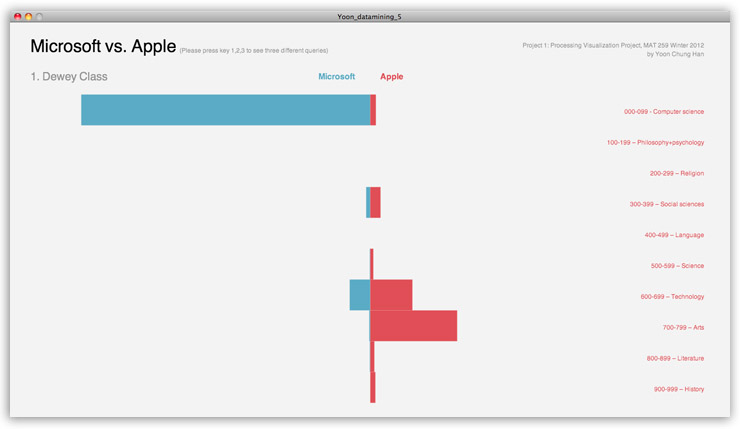
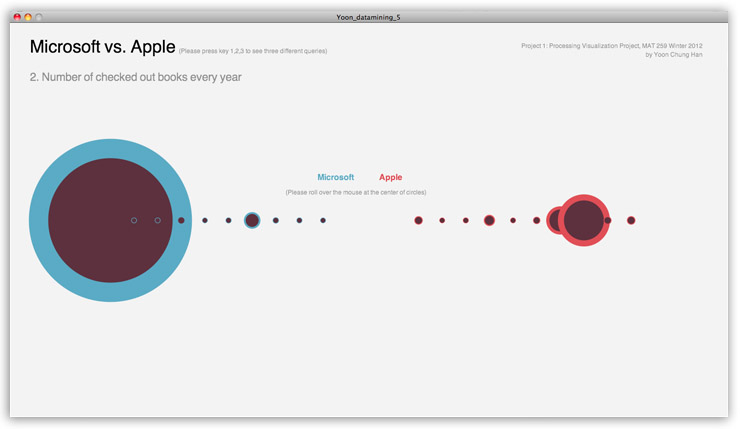
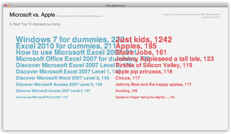
1. Microsoft vs. Apple
Seattle is known as the city where have many well-known interstate or international companies such as Starbucks, Amazon, Microsoft... There are many famous companies, especially IT companies found in Seattle. The best example can be “Microsoft”, one of the biggest IT companies in the world. When it comes to a rival relationship between Microsoft and Apple, I was curious how much Seattle people are caring about their famous worldwide company “Microsoft” and how much they express interests in Microsoft with checking-out Microsoft books, media, or any other references about Microsoft from Seattle Public Library. Also, I wondered if the boom of “Apple,” the rival company, attacked to Seattle as like other cities and countries in the world, and I assumed it might affect to change Seattle people’s interests toward Apple over years or just stay in Microsoft.
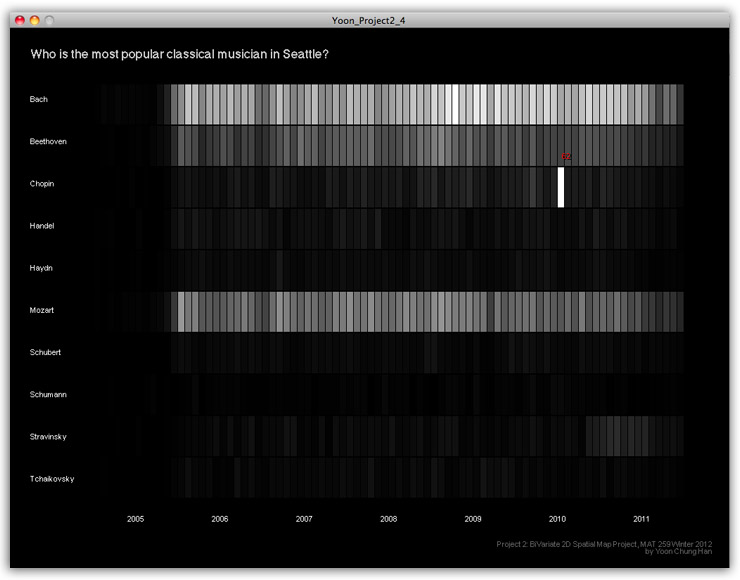
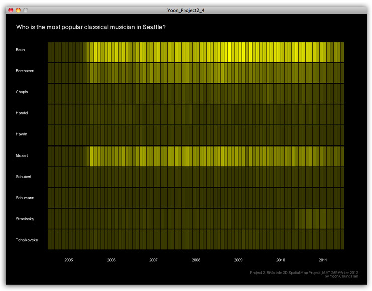
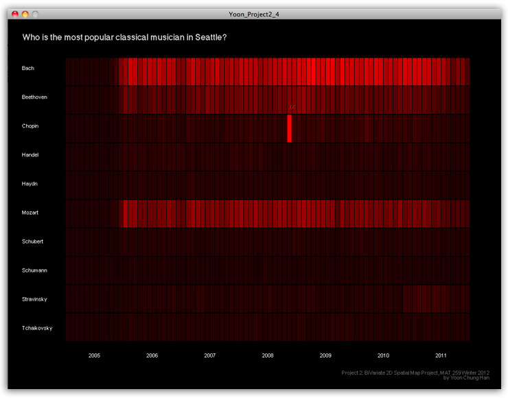
2. Who is the most popular musician in Seattle?
Seattle is a city rich in a music history supporting a thriving industry that is renowned nationally and globally. In this project, I will explore how much Seattle people love a classical music and how many items related to the best 13 classical musicians they checked out from 2005 to 2010 at SPL.
Here's a list of the best 13 Classical musician
- Handel
- Beethoven
- Tchaikovsky
- Chopin
- Mozart
- Schoenberg
- Haydn
- Stravinsky
- Schumann
- Brahms
- Schubert
- Bach
- Debussy
In a visualization graph, left side will show the visualization of data of checked out items each year and months. On the right side, there will be a list of 13 musicians vertically, and each musician's data can be explored by clicking a small checkbox. Each musician will be determined by different colors as a line, and users can select which musician they want to see or compare with other musicians. X axis in the graph will represent time(months and years), and Y axis will represent the number of checked-out items. In the X, Y cross position, there will be a small square with a given color based on musician’s name, and the square will be connected together with a light line. There will be a smooth animation that delivers a feeling of music equalizer.
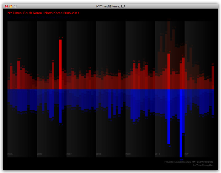
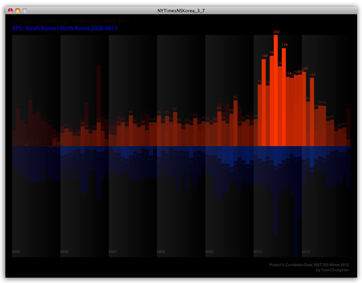
3. North Korea vs. South Korea
My goal of this project was to investigate how many items related to North Korea and South Korea were checked out from 2005 to 2011. And I was also interested in different results between NYTimes and Seattle Public Library since NYTimes is based on newspaper and online articles, and Seattle Public Library contains many different kinds of mediums and contents. I was curious how much items people checked out, and how it would be related to each other over years. In this data visualization, I mostly focused on color contrast: Red as North Korea and Blue as South Korea. The two color represent the national colors in national flags, and it directly shows the two countries' different identities. Through this research, I was surprised that there were quite many items checked out over years, and NYTimes and SPL showed different peak times.
Please click here to see the another project called "Earth: Data Visualization"
Supporter: Prof. George Legrady