Earth

Microsoft vs. Apple
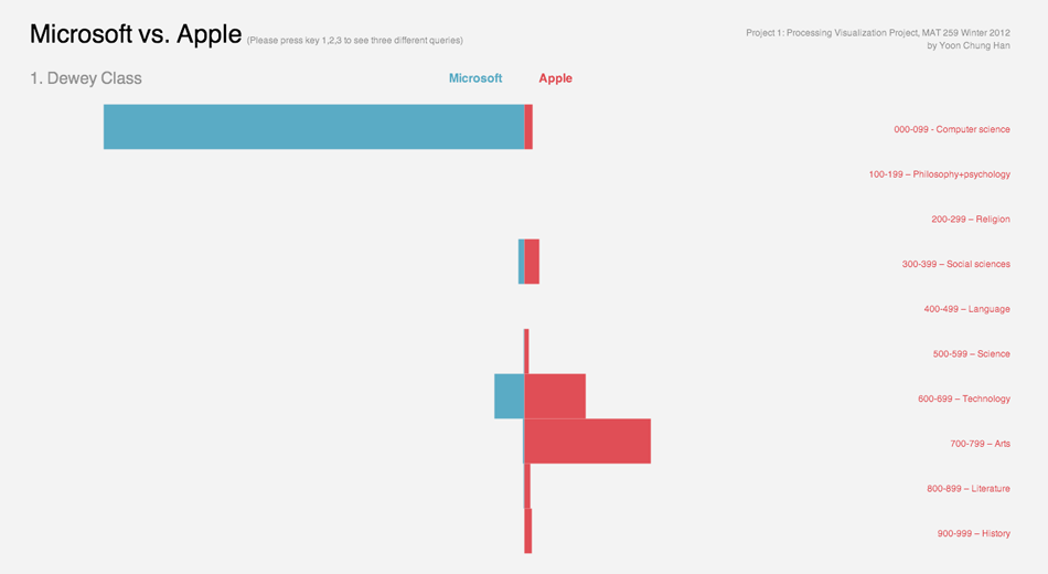
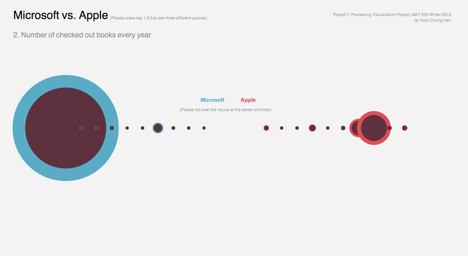
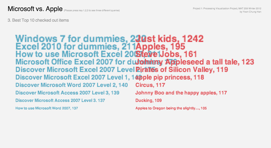
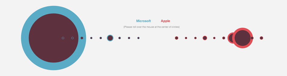
How much are Seattle people interested in Microsoft compared to Apple? Seattle is known as the city where have many well-known interstate or international companies such as Starbucks, Amazon, Microsoft... There are many famous companies, especially IT companies found in Seattle. The best example can be "Microsoft", one of the biggest IT companies in the world. When it comes to a rival relationship between Microsoft and Apple, I was curious how much Seattle people are caring about their famous worldwide company "Microsoft" and how much they express interests in Microsoft with checking-out Microsoft books, media, or any other references about Microsoft from Seattle Public Library. Also, I wondered if the boom of "Apple," the rival company, attacked to Seattle as like other cities and countries in the world, and I assumed it might affect to change Seattle people's interests toward Apple over years or just stay in Microsoft.


Info
Year: 2013
Type: Infographic, Data Visualization

Tools: Processing, MySQL

Concept Design, Visual Development, User Experience Design: Yoon Chung Han
Advisor: Prof. George Legrady


Explanation: I searched the number of checked out items titled "%Microsoft% and "%Apple%" in 10 different categories of dewey classes and past 6 years (2005-2010). Additionally, I searched the most popular 10 items that was checked-out within 6 years, and made a list for each company.

Result and Analysis: In this first project, I would like to explore the different way of visualizing the mining data in various designs, so I used the basic design elements such as bars, circles, and texts. There were three different information, and I used the three different design concepts for each data information. My first attempt was to contain all the information in one space, however it looked too overwhelmed and packed so it was hard to read the information clearly in one sight. Thus, I divided it into three pages, and users can change pages by pushing keys. The first design is a simple bar animation, which is a very intuitive and direct design. The length of each bar represents the number of checked-out items on each dewey category. The dewey list is on the right side of the design. The second design shows the circles of each year, and the radius of circles represent the number of checked-out items each year. If users roll over a mouse pointer at the center of the circles, the exact number of checked-out items with year number is appeared. Lastly, the last page contains the best 10 checked-out items, and there's no interactivity. Overall, the clear color contrast between blue and red shows the rival relationship between Microsoft and Apple.


Cloud Bridge
Interactive Data Visualization and
Sonification
Earth
SPL Data Visualization
Seattle Musicians
SPL Data Visualization
North + South Korea
SPL Data Visualization
2D Spatial Map
SPL Data Visualization, M259 Class Lab exercise
Microsoft vs. Apple
Infographic, SPL Data Visualization
Pattern Formation
Algorithimc Pattern Creation Practice
Sound Tree Rings
Sound Visualization