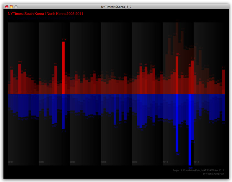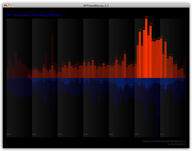
North + South Korea
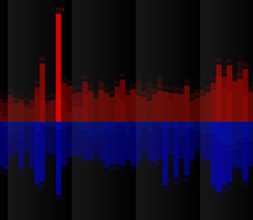
The goal of this project was to investigate how many items related to North Korea and South Korea were checked out from 2005 to 2011. And I was also interested in different results between NYTimes and Seattle Public Library since NYTimes is based on newspaper and online articles, and Seattle Public Library contains many different kinds of mediums and contents. I was curious how much items people checked out, and how it would be related to each other over years. In this data visualization, I mostly focused on color contrast: Red as North Korea and Blue as South Korea. The two color represent the national colors in national flags, and it directly shows the two countries' different identities. Through this research, I was surprised that there were quite many items checked out over years, and NYTimes and SPL showed different peak times.